在上一篇《CSS 布局大比拼:浮动、Flex、Grid 实战对比,看完就知道该用哪个!》文章中我们主要是对常见的布局方式做了个对比,我们今天主要是通过常见的布局场景来看看Grid怎么用。
基础网格布局
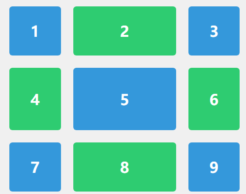
我们先来看看一个简单的3x3网格,使用 fr 单位和 gap,第二列的宽度是另外两列的两倍(2fr vs 1fr)。中间的行高度会随着内容变化,而首尾行高度固定。每个项目(item)之间都有20px的间隙。
<style> .container { display: grid; grid-template-columns: 1fr 2fr 1fr; grid-template-rows: 80px auto 80px; gap: 20px; height: 100vh; padding: 20px; box-sizing: border-box; background-color: #f0f0f0; }
.item { background-color: #3498db; color: white; border-radius: 5px; display: flex; justify-content: center; align-items: center; font-size: 1.5rem; font-weight: bold; }
.item:nth-child(even) { background-color: #2ecc71; } </style> <div class="container"> <div class="item">1</div> <div class="item">2</div> <div class="item">3</div> <div class="item">4</div> <div class="item">5</div> <div class="item">6</div> <div class="item">7</div> <div class="item">8</div> <div class="item">9</div> </div>
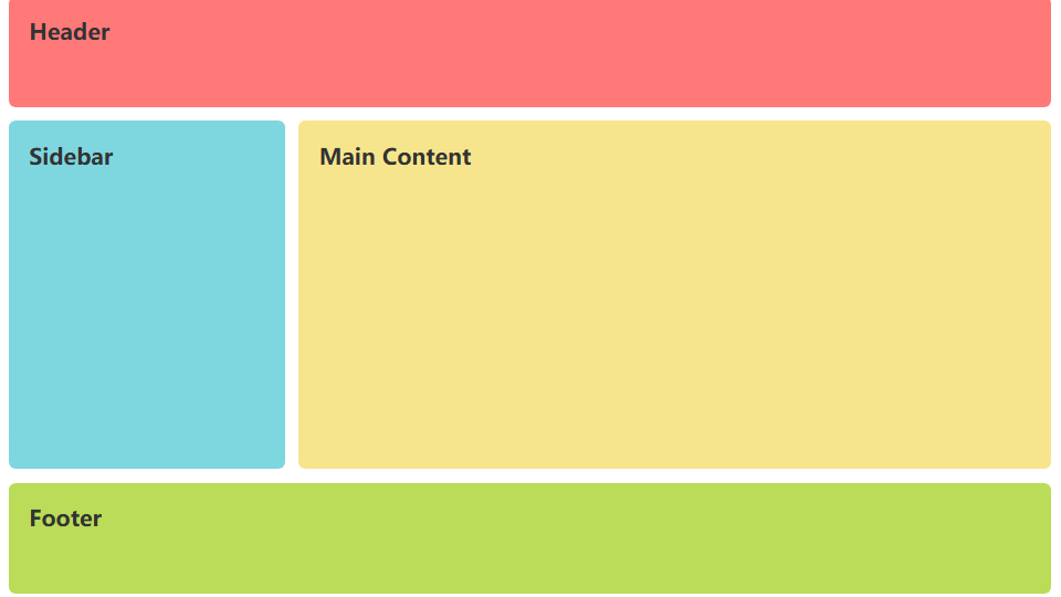
经典的圣杯布局
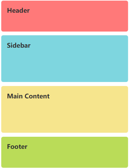
使用Grid轻松实现Header, Footer, Sidebar, Main Content区域,并添加简单的响应式。在桌面端,会看到经典的Header、左右布局、Footer结构。调整浏览器窗口宽度小于768px时,布局会自动变为单列堆叠,Sidebar移动到Main Content上方,非常适合移动设备浏览。
<style> body { margin: 0; padding: 0; }
.container { display: grid; grid-template-areas: "header header" "sidebar main" "footer footer"; grid-template-columns: 200px 1fr; grid-template-rows: 80px 1fr 80px; height: 100vh; gap: 10px; padding: 10px; box-sizing: border-box; } .header { grid-area: header; background-color: #ff7979; }
.sidebar { grid-area: sidebar; background-color: #7ed6df; }
.main { grid-area: main; background-color: #f6e58d; }
.footer { grid-area: footer; background-color: #badc58; }
.header, .sidebar, .main, .footer { padding: 15px; border-radius: 5px; color: #333; font-weight: bold; }
@media (max-width: 768px) { .container { grid-template-areas: "header" "sidebar" "main" "footer"; grid-template-columns: 1fr; grid-template-rows: 80px auto auto 80px; } } </style> <div class="container"> <header class="header">Header</header> <aside class="sidebar">Sidebar</aside> <main class="main">Main Content</main> <footer class="footer">Footer</footer> </div>
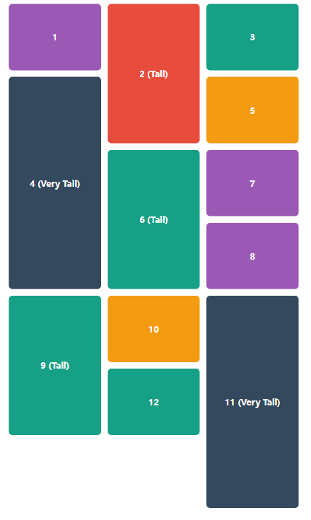
照片墙/瀑布流布局
使用 grid-auto-rows 和 span 关键字创建高度不一的卡片布局。一个不均匀的网格布局,有些卡片较高,有些较矮,形成了类似瀑布流的效果。用grid-auto-rows 设置了基础行高,而 grid-row: span X 让某些项目跨越多个行轨道。repeat(auto-fit, minmax(200px, 1fr)) 确保了布局是响应式的。
<style> .container { display: grid; grid-template-columns: repeat(auto-fit, minmax(200px, 1fr)); grid-auto-rows: 150px; gap: 15px; padding: 20px; }
.item { background-color: #9b59b6; border-radius: 8px; display: flex; justify-content: center; align-items: center; color: white; font-weight: bold; font-size: 1.2rem; }
.tall { grid-row: span 2; background-color: #e74c3c; }
.very-tall { grid-row: span 3; background-color: #34495e; }
.item:nth-child(3n) { background-color: #16a085; } .item:nth-child(5n) { background-color: #f39c12; } </style> <div class="container"> <div class="item">1</div> <div class="item tall">2 (Tall)</div> <div class="item">3</div> <div class="item very-tall">4 (Very Tall)</div> <div class="item">5</div> <div class="item tall">6 (Tall)</div> <div class="item">7</div> <div class="item">8</div> <div class="item tall">9 (Tall)</div> <div class="item">10</div> <div class="item very-tall">11 (Very Tall)</div> <div class="item">12</div> </div>
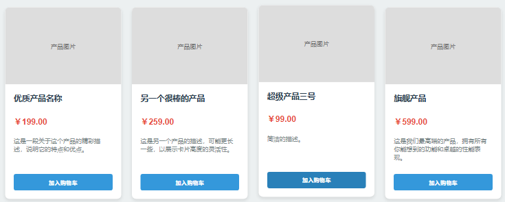
电商产品卡片
结合Flexbox和Grid,并使用 auto-fit 和 minmax() 实现完全响应式,典型的电商产品列表,Grid布局 (products-grid) 负责外部的响应式网格,会根据容器宽度自动调整每行显示的产品数量(至少250px宽)。每个产品卡片的内部则使用Flexbox进行精细的排版,确保按钮始终位于卡片底部。无需媒体查询即可实现响应式。
<style> body { background-color: #ecf0f1; padding: 20px; font-family: ; }
.products-grid { display: grid; grid-template-columns: repeat(auto-fit, minmax(250px, 1fr)); gap: 25px; max-width: 1200px; margin: 0 auto; }
.product-card { display: flex; flex-direction: column; background-color: white; border-radius: 10px; overflow: hidden; box-shadow: 0 4px 8px rgba(0, 0, 0, 0.1); transition: transform 0.3s ease; }
.product-card:hover { transform: translateY(-5px); }
.product-image { height: 180px; background-color: #ddd; display: flex; align-items: center; justify-content: center; color: #777; font-size: 0.9rem; }
.product-info { padding: 20px; display: flex; flex-direction: column; flex-grow: 1; }
.product-title { margin-top: 0; color: #2c3e50; }
.product-price { color: #e74c3c; font-size: 1.2rem; font-weight: bold; margin: 10px 0; }
.product-description { color: #7f8c8d; font-size: 0.9rem; flex-grow: 1; }
.add-to-cart-btn { background-color: #3498db; color: white; border: none; padding: 10px 15px; border-radius: 5px; cursor: pointer; margin-top: 15px; font-weight: bold; transition: background-color 0.2s ease; }
.add-to-cart-btn:hover { background-color: #2980b9; } </style> <div class="products-grid"> <div class="product-card"> <div class="product-image">产品图片</div> <div class="product-info"> <h3 class="product-title">优质产品名称</h3> <p class="product-price">¥199.00</p> <p class="product-description">这是一段关于这个产品的精彩描述,说明它的特点和优点。</p> <button class="add-to-cart-btn">加入购物车</button> </div> </div>
<div class="product-card"> <div class="product-image">产品图片</div> <div class="product-info"> <h3 class="product-title">另一个很棒的产品</h3> <p class="product-price">¥259.00</p> <p class="product-description">这是另一个产品的描述,可能更长一些,以展示卡片高度的灵活性。</p> <button class="add-to-cart-btn">加入购物车</button> </div> </div>
<div class="product-card"> <div class="product-image">产品图片</div> <div class="product-info"> <h3 class="product-title">超级产品三号</h3> <p class="product-price">¥99.00</p> <p class="product-description">简洁的描述。</p> <button class="add-to-cart-btn">加入购物车</button> </div> </div>
<div class="product-card"> <div class="product-image">产品图片</div> <div class="product-info"> <h3 class="product-title">旗舰产品</h3> <p class="product-price">¥599.00</p> <p class="product-description">这是我们最高端的产品,拥有所有你能想到的功能和卓越的性能表现。</p> <button class="add-to-cart-btn">加入购物车</button> </div> </div> </div>
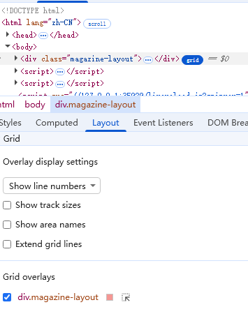
使用基于线的定位,让网格项跨越多个行列,创建视觉冲击力强的布局,这个布局打破了整齐的网格,创建了一个视觉重心。最大的「特色文章」区块横跨4列2行,立即吸引用户的注意力。其他文章区块大小不一,交错排列,形成了动态且有趣的杂志或新闻网站首页布局。关键在于使用 grid-column 和 grid-row 并指定起始和结束的网格线来精确控制每个项目的位置和大小。
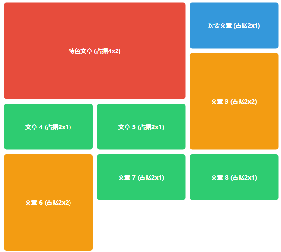
<style> .magazine-layout { display: grid; grid-template-columns: repeat(6, 1fr); grid-auto-rows: minmax(150px, auto); gap: 15px; max-width: 1200px; margin: 0 auto; padding: 20px; }
.featured { grid-column: 1 / 5; grid-row: 1 / 3; background-color: #e74c3c; }
.secondary { grid-column: 5 / 7; background-color: #3498db; }
.tertiary { grid-column: span 2; background-color: #2ecc71; }
.tall { grid-row: span 2; background-color: #f39c12; }
.magazine-layout > div { padding: 20px; border-radius: 8px; color: white; font-weight: bold; font-size: 1.2rem; display: flex; align-items: center; justify-content: center; } </style> <div class="magazine-layout"> <div class="featured">特色文章 (占据4x2)</div> <div class="secondary">次要文章 (占据2x1)</div> <div class="tertiary tall">文章 3 (占据2x2)</div> <div class="tertiary">文章 4 (占据2x1)</div> <div class="tertiary">文章 5 (占据2x1)</div> <div class="tertiary tall">文章 6 (占据2x2)</div> <div class="tertiary">文章 7 (占据2x1)</div> <div class="tertiary">文章 8 (占据2x1)</div> </div>
阅读原文:https://mp.weixin.qq.com/s/Trp31UUbZzMCdb76TSkzFw
该文章在 2025/9/22 15:31:28 编辑过


 400 186 1886